I created their design system involving component libraries, icons, typography, etc. that utilized Figma variables.
1.0 About Students Landing & the Need for a Design System
Students Landing is a startup in the property technology industry. Their goal is to help international students find and rent properties in the United States.
Role
Founding Designer,
UX & UI Designer
Project Duration
June 23 - September 23
4 Months
Tools Used

1.1 As one of the founding designers, I designed the first draft of their webapp within a month.
I conducted user research and created user personas, wireframes, information architecture, and high-fidelity responsive screens. To ensure a smooth developer handoff, I utilized auto-layout in all my designs, adequately named layers, and organized pages according to their respective URLs.
Additionally, I applied their brand identity to a purchased template to ensure the website's implementation began within a week.
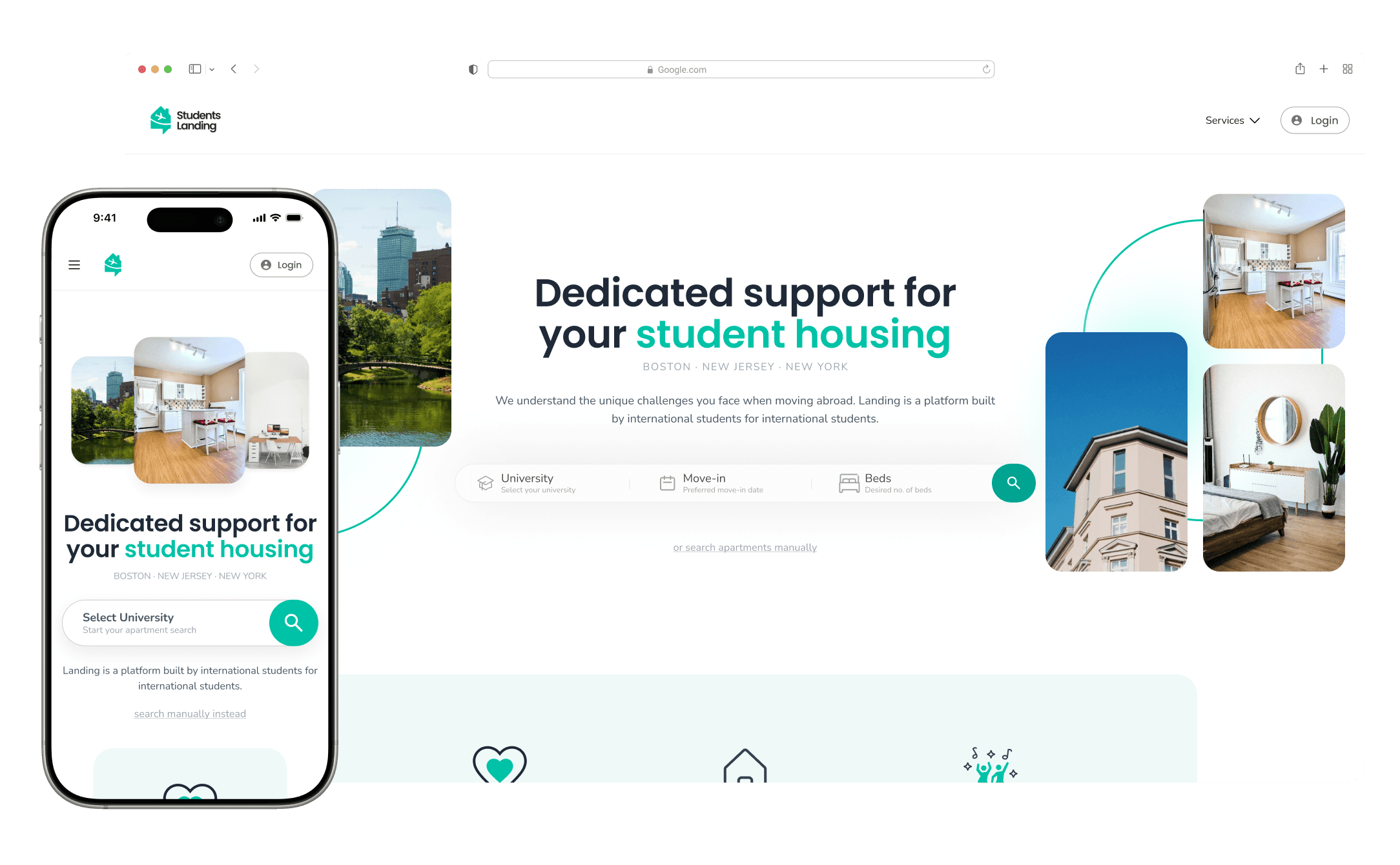
Image: Landings Home Page
1.2 As we scaled, I noticed inconsistencies that broke the user experience.
I was already aware of the slower workflow within the design team, as a significant amount of time was spent correcting inconsistencies. I attributed this issue to the absence of a design system.
5 Inconsistent components
Components serving the same function within a similar context were visually inconsistent.

30+ Visual Inconsistencies
Incorrect colors, spacing, and typography negatively impacted our brand language.
Slow Design Workflow
We spent too much time creating consistent web pages.
1.3 I advocated for the design system by proposing three core benefits.
Design Workflow Efficiency
A universal component library and style guide in Figma, featuring drag-and-drop functionality, enabled faster screen assembly.
Development Efficiency
With reusable components and design tokens, developers could ensure faster updates and deployments.

Coherent Brand Identity
A design system unifies brand elements—colors, typography, and UI behaviors, creating a consistent experience.
2.0 Impact: 50% Increase in Efficiency
The drag-and-drop functionality enabled us to quickly create new pages without the need for copying and pasting, while ensuring that any component-level changes were seamlessly incorporated across multiple pages.
Time to Design
Without Design System: 13m 30s
Video: Without Design System
Time to Design
With Design System: 6m 30s
Video: With Design System
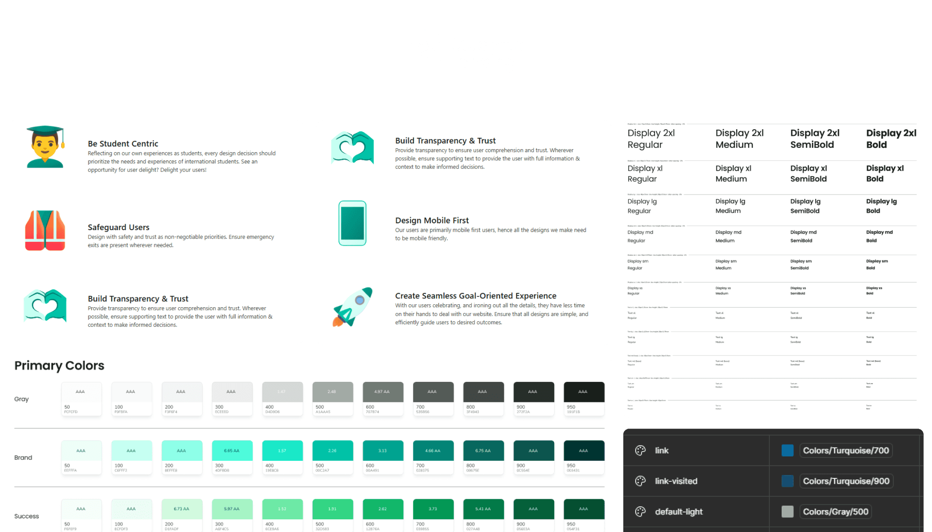
3.0 Establishing Design Principles for the Design System
I collaborated with the leadership team to identify key values they emphasized. Using previously created personas, I iterated on these proposed values to ensure alignment with our user audience's motivations. This process led to the creation of our design principles, which served as guidelines for designing experiences and components.

3.1 Be Student Centric
Our design system prioritizes the needs of international students through empathy and thoughtful design.
3.2 Safeguard Users
Design with safety and trust as non-negotiable priorities, ensuring that emergency exits are incorporated wherever necessary.

3.3 Design Mobile First
Our users are primarily mobile-first, so all our designs must be optimized for mobile devices.

3.4 Create Seamless Goal-Oriented Experience
Design simple and efficient experiences that seamlessly guide busy users toward their goals.

3.5 Build Transparency & Trust
Ensure transparency by providing supporting text to build trust and enable informed decision-making.
4.0 Establishing Typography: Nomenclature, Fonts, Weights, etc.
Since our system already utilized Tailwind CSS as its front-end framework, I developed a design system that adhered to a similar nomenclature while incorporating custom components.
4.1 Display Font: Poppins
Since our brand voice was meant to be comforting yet bold, I chose to retain Poppins as the display font. This font offers various weights, which were effectively utilized across the website.
✅ Resonates with our users as a "fun" and "trendy" font.
✅ Includes essential weight options.
✅ Heavier weights convey a "loud" and impactful voice.
✅ Ensures legibility in detailed text.

Image: Display Fonts
4.2 Paragraph Font: Nunito
✅ Accommodates long paragraphs within smaller spaces.
✅ Includes essential weight options.
✅ Ensures legibility in detailed text.
✅ Pairs well with other fonts, adding "playfulness" to the experience through rounded edges.
Image: Paragraph Fonts
5.0 Color Palette
The primary brand color was sea green (700, #028375). I defined standard success, error, and warning colors to harmonize with the brand palette and infused a hint of the brand color into the grays for visual consistency. I conducted accessibility checks for all colors, including their light and dark variants, and specified appropriate shades for use on various backgrounds.
✅ Accessibility-tested for all color combinations.
✅ Gradients defined as reusable styles.
✅ Colors established as design tokens (variables) for seamless developer handoff.

Image: Color Palette + Styles
6.0 Design Tokens
I created design token variables for colors, padding, margins, and divider sizes, enabling cascading updates throughout the design. To streamline the developer handoff, I aligned all variable names and tags with Tailwind's predefined standards.
6.1 Global Variables allowing for full-brand cascading changes.
I established global variables for color values and implemented a spacing system based on a hybrid 4pt and 8pt grid.

Image: Global Variables
6.2 Alias Variables, children of global variables.
These values are derived from global tokens, allowing them to automatically adapt to changes in the global variables. They are presented as Figma’s preferred property values, enabling quicker and more consistent application across components.

Image: Alias Variables
7.0 Iconography
I utilized a pre-existing icon library from the base template, added custom icons when needed, and created size variants as part of the design system atoms. Custom icons are:


Image: Custom Icons
8.0 Component Setup
The components are organized in a cascading hierarchy: Atoms, Molecules, and Organisms. This structure allows cascading changes to higher-level components when updates are made at the atomic level.
8.1 Atoms, these are the smallest possible components.
Atomic components consisted of buttons, tags, logos, icon place holders, etc.
Image: Atomic Components
8.2 Molecules, built using atoms.
These included components such as cards, modals, dropdown menus, and input groups. Each molecular component is designed with properties that control its composition and behavior.
Image: Molecular Components

Image: Component Example
8.3 Organisms
These included elements such as headers, footers, page layouts, and sections, which together form a cohesive user experience.

Image: Hero/Section Components

Image: Navbar Component